Back “in the day,” underlining was used only on typewriters for just one purpose—to add emphasis in paragraphs. Typewriters are limited, and can only type one type of character, or font, as well as only one point size and style. The output from typewriters pretty much looks like Courier:

If you wanted to emphasize something, you were pretty much limited to using ALL CAPS for headings, or underlining for italics.
But look what happens when you use underlining with lowercase letters:

The underlines will either type right on top of the descenders of letters, or will stop around the descenders. It is not only more difficult to read, but just looks bad—especially when you have other choices for adding emphasis.
Alternatives to Underlining
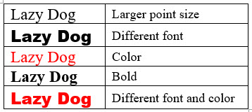
Use any one (or more) of the following choices instead of underlining. You can even combine some of these, if you like, for adding emphasis.
- Larger point size
- Different Font
- Color
- Bold
Samples (all 14-point type)